This type of article usually pops up just before or just after the New Year. Then it’s all about questions like “What are the web design trends for 2024?” or “What will change in web design in 2025?”, whereupon the author of the article then gives a not particularly bold forecast of how things will develop in web design, based on the current status quo.
In this little article, however, we don’t want to look into the next year or the year after, but we try to anticipate what the next big change in web design will be and what a typical website might look like then. For this we don’t have to let our imagination run wild like in science fiction, but can make relatively concrete predictions based on current developments.
It would be important to mention in advance that we do not want to deal here with how a website will be created in the future. This question offers material for a separate article, to which we may return at some point. No, instead we’ll just focus on the result, i.e. what a typical website will look like in a few years, how it will be operated by the user, how it will interact with the user.
To do this, let’s first take a very brief look at what websites used to look like. Early websites consisted mainly of static HTML code, were very text-heavy, and often had limited design options in terms of graphical and multimedia elements. The ability to interact with a website was almost non-existent, as was the ability to accommodate different user preferences or needs. Responsiveness, fast loading times or secure surfing had not been thought of at all.
Over time, websites evolved into interactive, visually appealing and responsive platforms that could offer a wide range of media, interactions and personalized experiences. This had mostly to do with advances in technology, design, and development. Specifically, the establishment of CSS, Javascript and Ajax, as well as smartphone and tablet, social media and broadband Internet.
In contrast to the past, responsive design and mobile optimization are very important for websites today, as more and more users surf on different devices such as smartphones, tablets and desktops. Websites automatically adapt to the screen size to ensure a consistent and optimized display.
Not only did minimalism start its triumphant march in the field of living and furnishing a few years ago, but minimalism is also a prevailing trend in web design. Clear, simple layouts with flat UI elements promote usability and help focus on the main content. The motto is “less is more” with emphasis on clear design and easy-to-understand interfaces.
Microinteractions are small, subtle animations or movements of elements that provide feedback to users or enhance their interactions on web pages. Animations are used not only for visual stimulation, but also to provide clear direction to users and enhance the user experience.
There is also a pragmatic reason for the increasing popularity of the so-called “dark mode”. This is not only an eye-friendly alternative to the bright design, but can also extend the battery life of devices with OLED or AMOLED screens. Dark backgrounds with high-contrast elements are a trademark of this trend.
Certain websites are increasingly relying on long scrolling pages to tell stories or present information in a step-by-step manner. This allows for a fluid and cohesive narrative without the user having to switch between different pages.

When it comes to the future, AI is currently the first thing that comes to people’s minds. Even when it comes to web design, AI will without any question leave a huge footprint and change the future of web design in many ways. Be it in analyzing big data to improve content, through automations, for example, in designing layouts, or with chatbots that provide interactive support and improve the user experience.
A few years ago, voice search was considered the next big thing, even in the mainstream thanks to Siri, Alexa and co. And even though this has now taken a bit of a backseat due to other technological developments, the increasing prevalence of voice-driven search queries and voice user interfaces is still there and will continue to have an impact on web design as we know it.
Now let’s move on to the driver that we believe will have the strongest impact on web design – VR and AR. Virtual Reality (VR) will be the future of web design in the long run. Augmented Reality (AR), on the other hand, will pave the way and in the medium term turn web design as we have known it upside down. As was the case with the iPhone, Apple’s latest product, the Vision Pro, will play a decisive role in making AR accessible to the masses. While only hardcore Apple fans and AR enthusiasts will be willing to spend $3499 on AR/VR glasses when sales begin early next year, the launch is still the first step toward broader adoption of the technology. The fact that other big tech companies, such as Mark Zuckerberg’s Meta, are also fully betting on this card underscores the momentum that this development has already gained.
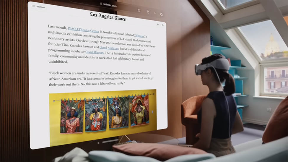
Augmented reality, after all, means adding additional elements to the user’s live environment. One such element could be, for example, the browser on which we visit websites. What this looks like in concrete terms can be seen in the introductory video for Vision Pro. The size of the browser can be changed at will – in fact, it can be changed so much that it can cover an entire wall. What this means for website developers is that, unlike the mobile-first approach, you have to optimize photos and graphics in terms of pixels upward as well, not just downward, to make sure images look good even in huge browser windows.

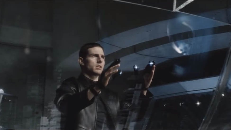
Unlike what can be observed in the introductory video for the Vision Pro, we believe that scrolling will fundamentally change and that this will be perhaps the biggest change in web design. From our perspective, vertical scrolling, as we do with the mouse wheel on our PC mouse or swiping on our smartphone, for example, is anything but intuitive when using AR. The intuitive movement would be horizontal wiping (away), something like Steven Spielberg showed us back in 2002 with the movie Minority Report. In an early scene of the film, Tom Cruise aka John Anderton wipes away content on his hologram screens to the side rather than down. Why? Because that’s the natural and least-effort movement in this situation. This means that in the future, developers and designers will have to rely much more on horizontal scrolling and especially dragging movements to create intuitive website experiences.

We already explained why we believe that horizontal is becoming the new vertical in the last section. But we go one step further and believe that scrolling will be replaced by dragging, because we want to minimize the number of hand or finger movements while browsing a site. Consequently, for us as developers, this means that we will no longer have almost infinite (horizontal) space to place our elements, but will have to work with horizontal slides that users can reach with a single swipe. Through slides, we will be forced to present information in a much more condensed form than before and meet the individual need for more information through creative solutions. In addition, fullscreen background images and fullscreen videos will once again become much more important than they are currently. We had to search for a long time to find websites that can illustrate this right now. This website and, with some exceptions, this website came closest to our vision.
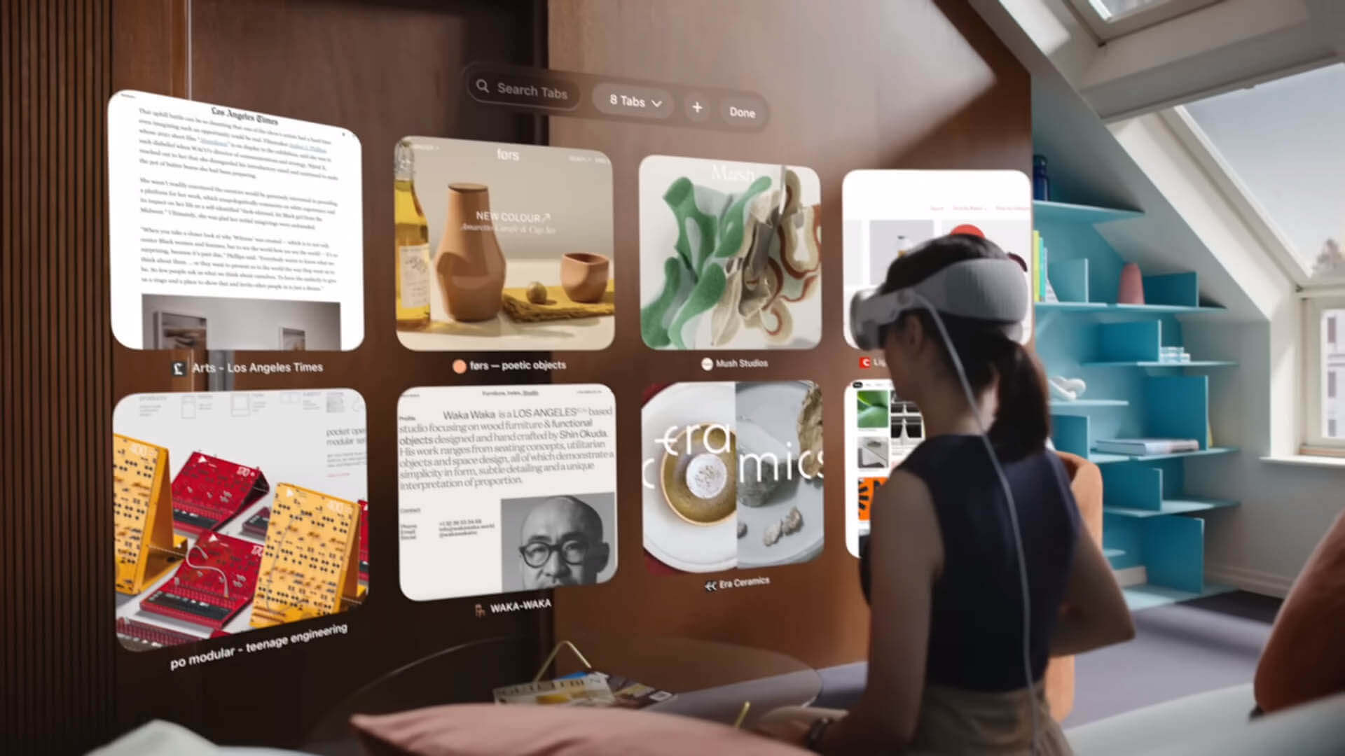
The way Apple sees the home page of its browser in Vision Pro is how we think the future menu of a website could look. Large preview images per menu item, in which the user can already see what awaits him on the respective subpage. These could be static or, like a GIF, show a dynamic preview of the respective subpage.

It is not difficult to imagine that the topic of voice user interfaces could gain in importance with the use of AR. The impact this could have on web design can be seen in the current use of such interfaces. However, what kind of changes are in store for us when we can select an element with the help of our eyes and “click” on it with a flick or the squeeze of our fingers requires a lot more imagination. How do you think this innovation could affect the web design of tomorrow?
Whether the launch of Apple’s Vision Pro really marks the start of a new era in web design or it’s just another new, way-too-expensive toy for tech nerds will soon become clear. Regardless of whether it will be Apple’s VR/AR glasses or some other product that convinces the masses and captivates them with this technology, we believe that the serious changes that are coming to our industry cannot be stopped. Whether it really comes down to what we have described here or whether it could go in a completely different direction is open to debate. And that’s exactly what we’re inviting you to do. What do you think awaits us in the coming years? And how do you want to react to it? What can you do as a web designer/web developer for yourself and/or for your customers right now? We are curious and look forward to your opinion and ideas!
Leave a Reply